If you have watched my talks or read anything I have written over the last few years, you know I spend a lot of time talking about design, experience, product innovation and the very real messiness that shows up when digital ambition collides with physical reality. That work is a meaningful part of what my teams and I do for several automotive clients.
It is also incredibly complex.
When you are designing inside regulated, high-stakes environments like automotive, there is a lot to think through. Technical constraints. Safety requirements. Regulatory frameworks. Brand heritage. Corporate dynamics. All of it layered on top of the basic human reality that someone is piloting a two-ton machine at speed.
In other words, this work is not easy, no matter how simple it might look once it is done well. Which is exactly why what dropped recently is so profound on so many levels.
I am talking about Ferrari and the collaboration led by Jony Ive and Marc Newson. Together, they designed the human-machine interface for Ferrari’s first electric vehicle. And the result is quietly radical.
A Return to Intentionality
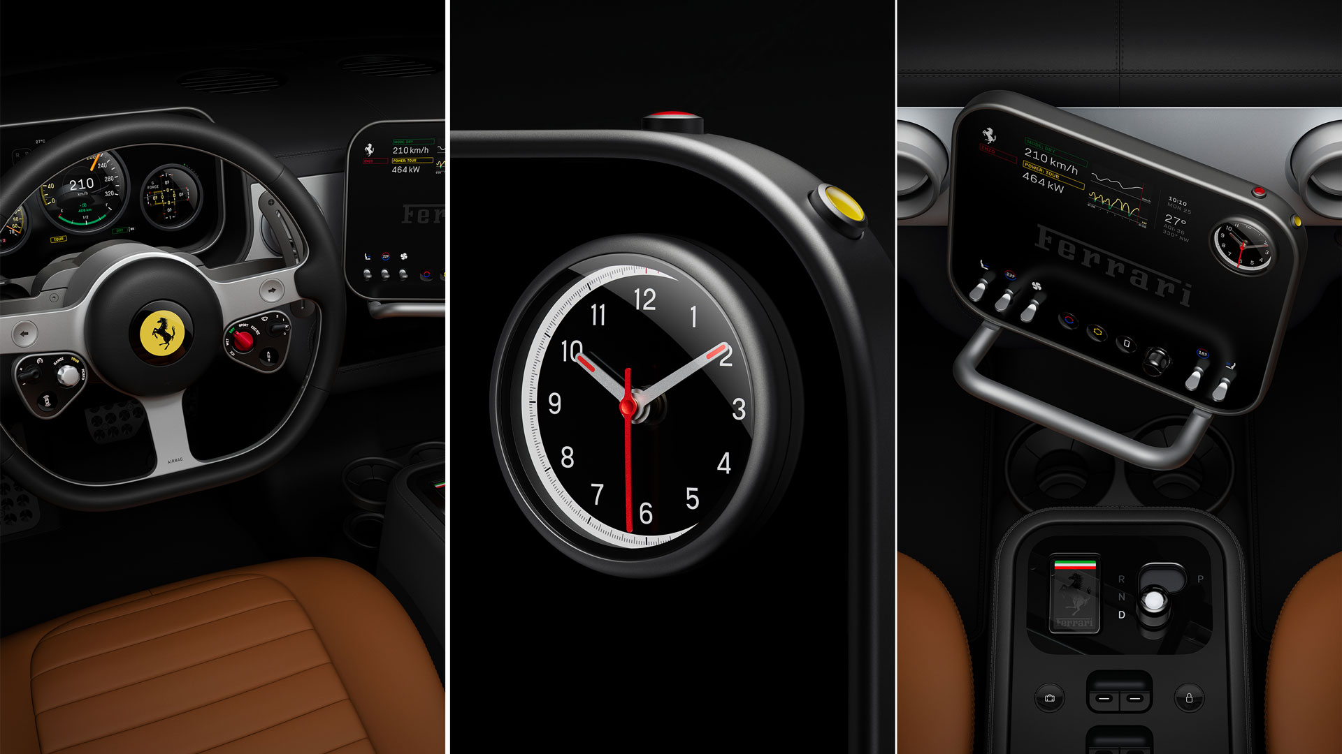
At a glance, the interior references Ferrari’s more functionally driven design language from the 1960s and 70s. There is restraint. Purpose. Mechanical honesty. But make no mistake, this is not nostalgia for nostalgia’s sake.
This is a serious departure from Ferrari’s recent digital design language. And frankly, thank God for that.
Over the last decade, many automotive interfaces became overwrought. They leaned hard into spectacle, skeuomorphism, and screen-first thinking. Too often they became caricatures of what they were attempting to be. Visually busy. Cognitively demanding. Emotionally hollow.


What Ive and Newson have done here is different. They have rejected the idea that innovation automatically means more glass, more pixels, or bigger screens. Like the Ferrari's of the past they have allowed function to define form and feature.
As Ive himself put it, touchscreens are “the wrong technology to be the primary interface” in cars. Not because touch is bad, but because context matters. The touchscreen worked for the iPhone because it solved a specific problem. A general-purpose interface replacing dozens of single-use physical controls. That logic collapses the moment you put it in a moving vehicle where attention is a finite and precious resource. While I agree in principle, I do think there's a place for touchscreens in cars. But only with other physical controls allowing for eyes off control and tactile interactions.
Why This Is So Hard to Get Right
Bridging physical and digital is brutally difficult.
It can only be done with extremely tight integration inside a singular design team, driven by a singular goal. Not feature checklists. Not competitive benchmarking. Not trend-chasing. One clear intent centered on human capability, safety, and delight.
This isn't new.
In a limited fashion, Ford has done as has some of the world’s teams that have supported General Motors. When it works, you immediately feel it. There is confidence. Muscle memory. A sense that the car is working with you, not demanding attention from you. But getting software to map directly to physical input can be difficult when you layer in the dozens of CPUs in a car, variable hardware processing units depending on supplier constraints, and the list goes on. And beyond that, it's dramatically more expensive than something that's 100% screen-based.
This kind of integration requires time, iteration, bespoke hardware, and above all deep cross-disciplinary collaboration. It does not scale easily. It does not ship fast. And it absolutely does not come from bolting software onto hardware at the eleventh hour.

Fashion Versus Problem Solving
One of the most telling observations Ive made is about how touchscreens spread through automotive design in the first place. Touch became fashion. A signal of modernity. Bigger screens became shorthand for innovation, even when they solved no meaningful problem other than potentially opening up revenue opportunities.
Great experiences aren't always centered on the newest technology but the right technology. In this Ferrari interior, touch still exists, but it is thoughtful, secondary, and contextual. The majority of interactions are physical. Every control feels different but digitally complimented in ways that amplify.

The Bigger Signal
What excites me most is not Ferrari specifically. It is the signal this sends to the industry.
As vehicles become electric, autonomous, and software-defined, the temptation is to lean even harder into abstraction. To replace materiality with pixels. To confuse flexibility with usability.
This interior quietly argues for the opposite. It suggests that the future of automotive experience will belong to teams who understand when digital should disappear, when physicality matters, and when digital restraint and physical craft is the most sophisticated move you can make.
This is not easy work. But when it is done well, it feels inevitable.

No Comments.